

The Menu Design Secrets That Influence What You Eat

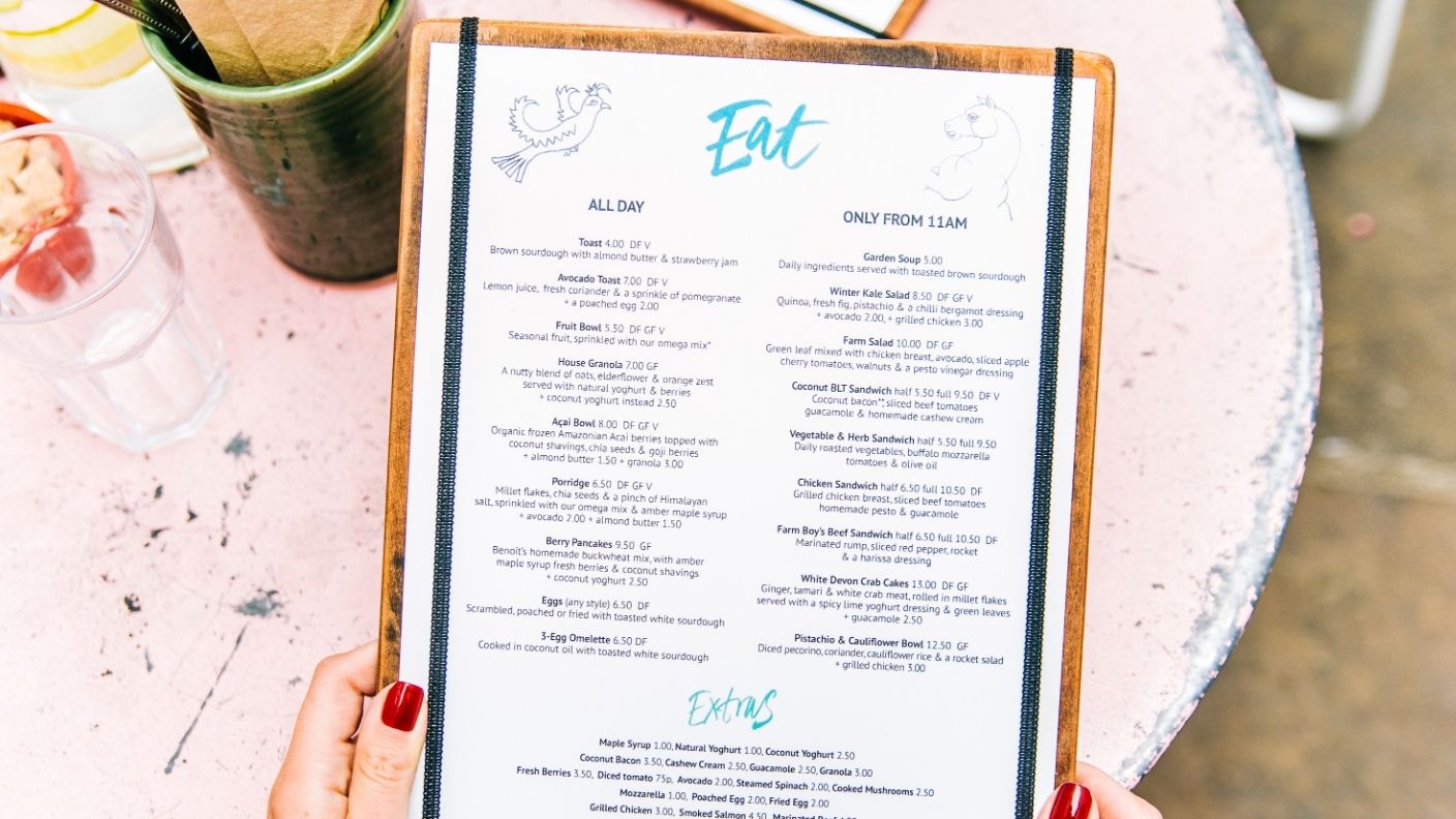

A restaurant menu looks like a simple list, but almost nothing about it happens by accident. Every color, word choice and dollar sign has usually been tested for exactly how it changes what people order.
Hospitality consultants have spent decades refining this into an actual discipline, sometimes called menu engineering. Most guests spend less than two minutes actually reading a menu, which leaves a surprisingly narrow window to steer a decision.
None of it involves outright trickery, more like a nudge dressed up as a design choice. Here is what is actually happening on the page the next time a menu lands on the table.
Where Your Eyes Land First
Diners tend to notice and order from the top and bottom of each menu section more than anywhere else, according to a breakdown from Neurolaunch. Restaurants place their most profitable dishes in exactly those spots for that reason.
Placement works alongside color too. Warm tones like red and orange are considered appetite stimulants, which is part of why so many fast food chains lean on them, while green signals freshness and works well for salads and lighter fare, according to Aaron Allen.
Even the number of items on a page matters. Too many options tend to increase anxiety and slow down ordering, so well designed menus deliberately limit choices within each section to keep decisions feeling easy.
Words Do More Work Than Ingredients
The exact same dish can sell differently depending purely on how it gets described. Sensory language like crispy, tender or slow roasted measurably increases both sales and how good the food is perceived to taste, even when the recipe never changes.
Phrases like grandmother’s recipe or farm fresh work the same way, creating an emotional connection that can justify a higher price. None of it requires the food to actually be different, just described differently.
The Price Tricks Hiding In Plain Sight
Pricing gets just as much strategic attention as anything else on the page. Restaurants often list an expensive item at the top of a section specifically so it never gets ordered, using it purely to make everything below it look like a better deal, a tactic known as decoy pricing.
Dollar signs themselves tend to disappear too, since seeing an actual price symbol has been shown to make diners think more about cost. Prices are also frequently listed without decimals or in a column that avoids lining up neatly, making it harder to scan and compare at a glance.
None of these techniques force anyone to order something they genuinely do not want. They just make certain choices easier to land on, which is exactly the point of a
RELATED ARTICLE: Americans Are Fiercely Loyal to These Foods—and Refuse to Apologize for It
